What's wrong with thegrid.io and this AI generated site?
Here are a few things I just had to get off my chest.
Before I start, just let me say that I really want the grid to succeed. The concept is still solid, and with a few more knobs and a little more polish I won’t even consider reverting back to a static site on S3…
The markup generated does not pass The W3C Markup Validation Service!
There were over 46 issues on this page alone last time I looked - https://validator.w3.org

Assets are hosted outside of with the site
The assets are scattered over at least 5 locations, meaning the site suffers from increased latency and can’t benefit from recent enhancements like http2.
- https://ajax.googleapis.com
- https://cdnjs.cloudflare.com
- https://cdn.thegrid.io
- https://the-grid-user-content.s3-us-west-2.amazonaws.com
- https://imgflo.herokuapp.com
To add to the latency, many of the assets are not minified / compressed, and make up around 20% of the requests.
This site has minimal content and yet the page source alone is 595KB!
If you add all the assets on the page, you end up with a total size of 63.3MB. Try rendering that on a mobile with 3 bars of connection.
There is no way to add a cookie banner to comply with EU cookie law
Region specific but still something you need to consider.
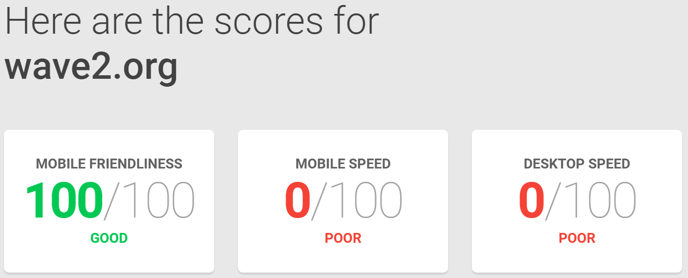
It’s just too slow
Like 10 seconds page load slow. Of course if the above items are fixed, things would be much improved.

Kudos to the mobile friendliness score tho!
Support took over 48Hrs to respond
If you have an issue with your site, you don’t want to wait 48Hrs+ before you get a response (weekends included, the web never sleeps).
I raised an issue with thegrid.io support yesterday about the performance of this site and was told
A kind human will get back to you in less than 24 hours.
Well I finally got a response after the weekend
Getting our load times down is a top priority coming up and should improve when we launch our new design system here in the coming weeks.
Sounds promising right!?
The image processing is flawed
Take a look at the logo at the top of the page. You can’t see the text right? That’s because the colors chosen by the AI didn’t take into account the images on the page.
In fact, some text on the page is hard to read, due to the lack of contrast against the background.
Rant over.